# How to Add a Color Picker to a Lottie Creator Plugin
*By Amir J · September 15, 2026*
Learn how to add a color picker to your Lottie Creator plugin and update the fill color of selected objects.
---
In this tutorial, we’ll extend the plugin we built in the previous part by adding a **color picker** that changes the fill color of a selected object inside Lottie Creator.
So far, our plugin has a button that creates a red animated rectangle. Now we’ll make the plugin interactive in the other direction as well: instead of only creating content, it will also modify content that already exists in the scene.
By the end of this tutorial, you’ll know how to:
- Add a color input to a Creator plugin
- Send color data from `app.tsx` to `plugin.ts`
- Convert a hex color into RGB
- Access the currently selected object in Creator
- Change the selected object’s fill color
- Improve the plugin layout with simple styling
- Use components from the Creator Plugins UI library
> If your goal is primarily to develop Creator plugins with a coding agent, you can skip ahead to the next part of the series. This tutorial focuses on understanding the implementation directly.
* * *
# Starting Point
Before continuing, you should already have the plugin from the previous tutorial.
That plugin contains a button that creates a red rectangle and animates its position.
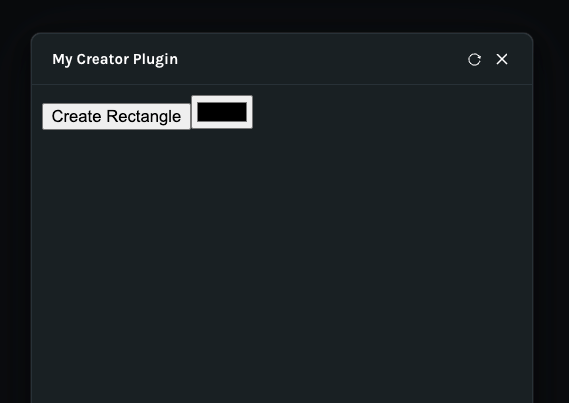
Our next goal is to add another control:
```
Create Rectangle
[ Color Picker ]
```
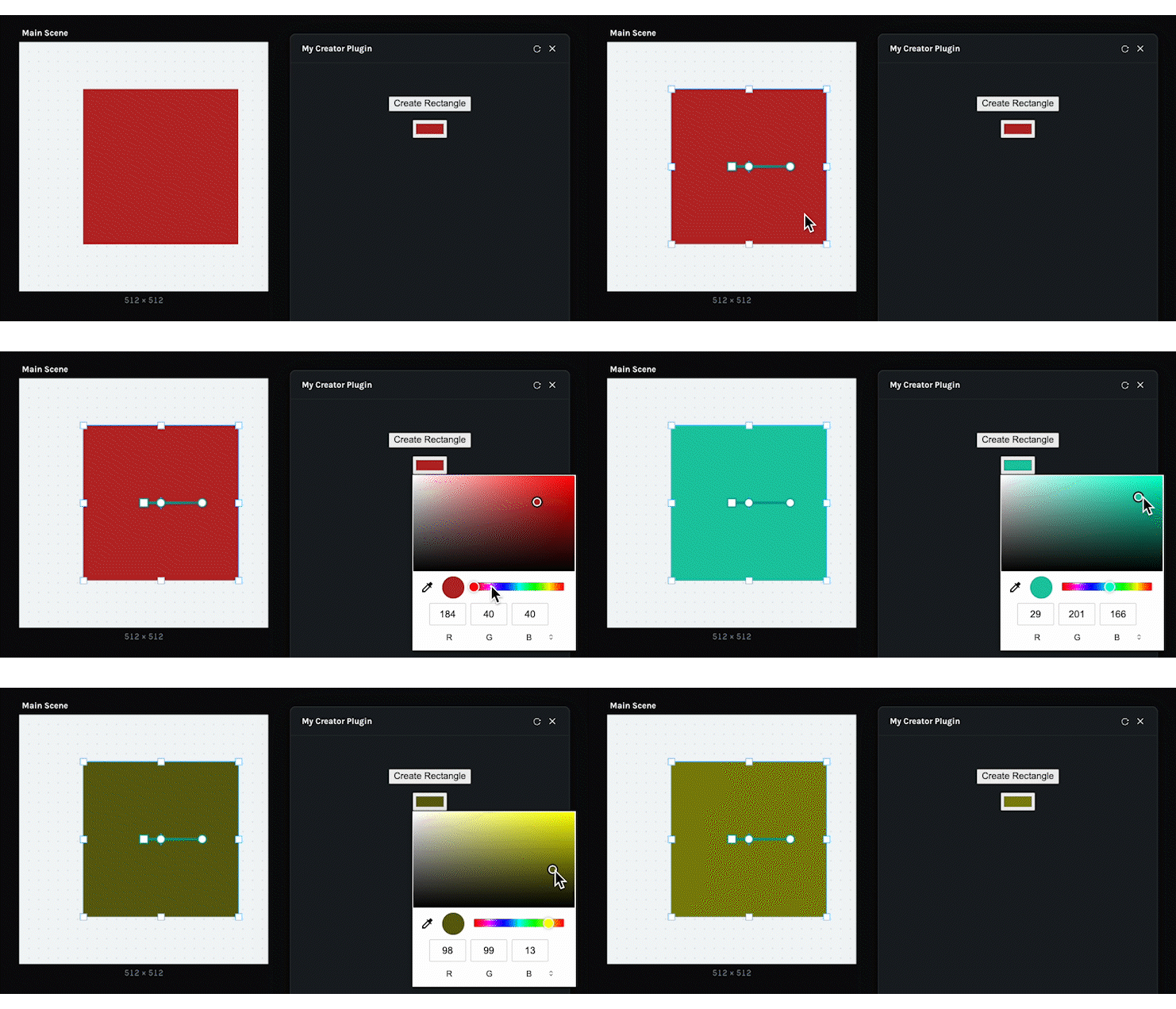
The user will select an object in Creator, choose a new color in the plugin, and the selected object’s fill will update.
* * *
## 1\. Add a Color Input
Open:
```
app.tsx
```
Below the existing **Create Rectangle** button, add a native HTML color input:
```tsx
return (
);
```
The new input uses:
```tsx
type="color"
```
which gives us the browser’s built-in color picker.
We also provide:
```tsx
onChange={changeColor}
```
so a function will run whenever the user selects a new color.
At this point, `changeColor` does not exist yet.
Let’s create it.
* * *
## 2\. Create the `changeColor` Function
Inside the `App` component, add a new function:
```tsx
const changeColor = (
event: React.ChangeEvent
) => {
};
```
The `event` gives us access to the color selected by the user.
We can retrieve it with:
```tsx
event.currentTarget.value
```
For example, selecting red might return:
```
#ff0000
```
There is one issue, though.
The browser gives us the color in **hex format**, while our plugin logic expects an RGB object such as:
```tsx
{
r: 255,
g: 0,
b: 0
}
```
So we need to convert the value before sending it to the plugin.
* * *
## 3\. Convert Hex to RGB
Inside the `changeColor` function, add a small conversion helper:
```tsx
const hexToRgb = (hex: string) => ({
r: parseInt(hex.slice(1, 3), 16),
g: parseInt(hex.slice(3, 5), 16),
b: parseInt(hex.slice(5, 7), 16),
});
```
This takes a color such as:
```
#ff8000
```
and converts it into:
```tsx
{
r: 255,
g: 128,
b: 0
}
```
Each pair of hexadecimal characters represents one color channel.
* * *
## 4\. Send the Color to the Plugin
Now use the same message-passing pattern we used for creating the rectangle.
Inside `changeColor`, add:
```tsx
parent.postMessage(
{
pluginMessage: {
type: "change-color",
color: hexToRgb(event.currentTarget.value),
},
},
"*",
);
```
The completed function becomes:
```tsx
const changeColor = (
event: React.ChangeEvent
) => {
const hexToRgb = (hex: string) => ({
r: parseInt(hex.slice(1, 3), 16),
g: parseInt(hex.slice(3, 5), 16),
b: parseInt(hex.slice(5, 7), 16),
});
parent.postMessage(
{
pluginMessage: {
type: "change-color",
color: hexToRgb(event.currentTarget.value),
},
},
"*",
);
};
```
The message now contains two things:
```
type: "change-color"
color: { r, g, b }
```
The communication flow is:
```
User chooses a color
↓
changeColor()
↓
Read hex value
↓
Convert hex → RGB
↓
postMessage()
↓
plugin.ts
```
* * *
# Improve the Plugin Layout
## 5\. Stack the Controls Vertically
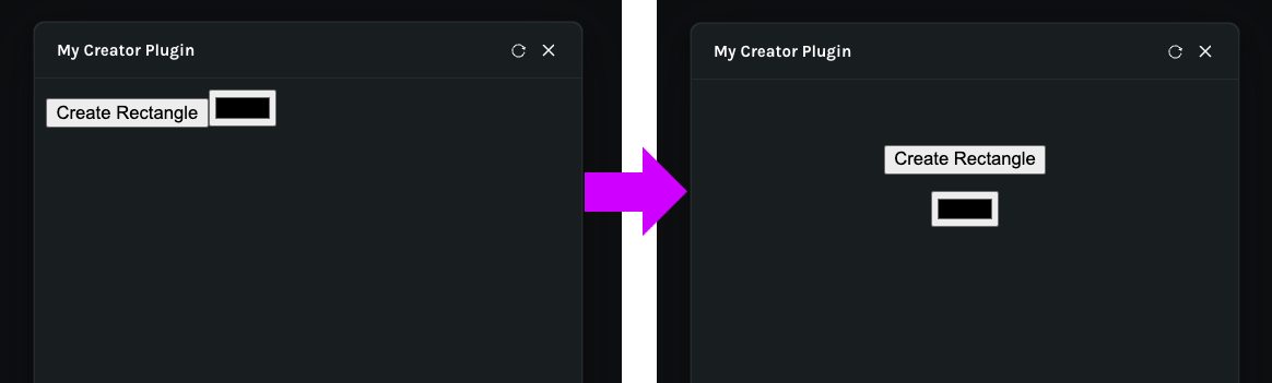
Right now, the button and color picker may appear close together or arranged awkwardly.
We can clean up the interface using a little inline styling.
Wrap both controls inside a `div` and add:
```tsx
style={{
display: "flex",
flexDirection: "column",
alignItems: "center",
gap: "12px",
paddingTop: "40px",
}}
```
The result looks like this:
```tsx
```
Here:
```
display: flex
```
enables Flexbox.
```
flexDirection: column
```
stacks the controls vertically.
```
alignItems: center
```
centers them horizontally.
```
gap: 12px
```
adds spacing between the controls.
```
paddingTop: 40px
```
adds space above the interface.
* * *
# Update the Selected Object
## 6\. Listen for the `change-color` Message
Now open:
```
plugin.ts
```
We already have logic that checks for:
```tsx
msg.type === "create-rectangle"
```
Add another condition for:
```tsx
msg.type === "change-color"
```
For example:
```tsx
if (msg.type === "change-color") {
}
```
This code will run whenever the user changes the color picker.
* * *
## 7\. Get the Selected Object
Inside the new condition, access Creator’s current selection:
```tsx
const node = creator.selection.nodes[0];
```
This gets the first selected object.
For this introductory example, we’re assuming that:
- An object is selected
- That object supports fills
In production code, you would normally add checks to make sure those assumptions are valid.
For now, we’ll keep the example concise.
* * *
## 8\. Get the Object’s Fill
Next, get the first fill on the selected node:
```tsx
const fill = node.fills[0];
```
Now we have access to the selected object’s fill.
* * *
## 9\. Change the Fill Color
Finally, set its static color value:
```tsx
fill.color.staticValue = msg.color;
```
The complete color-change logic is:
```tsx
if (msg.type === "change-color") {
const node = creator.selection.nodes[0];
const fill = node.fills[0];
fill.color.staticValue = msg.color;
}
```
That’s all we need.
The complete flow is now:
```
Select object in Creator
↓
Choose color in plugin
↓
app.tsx sends "change-color"
↓
plugin.ts receives message
↓
Get selected node
↓
Get first fill
↓
Set fill color
```
* * *
# Explore the Creator API
At this point, our plugin can both create content and modify existing content.
But how do we discover what else is possible?
Return to the **LottieFiles Extensions** and open:
```
Create a Plugin → Creator APIs
```
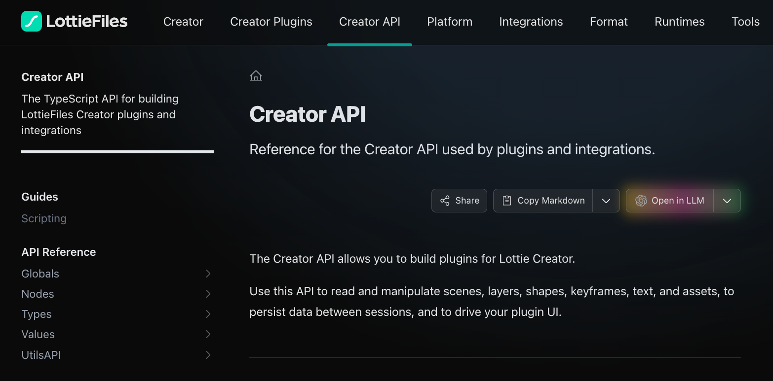
The Creator API documentation contains information about the different objects and properties available to plugins.
You can explore:
- Nodes
- Types
- Values
- Scene properties
- Shape properties
- Animation properties
- Selection APIs
- Fill and stroke properties
This documentation is the main reference when you want to understand what your plugin can read or modify inside Creator.
* * *
# Use the Creator Plugins UI Library
## 10\. Open the UI Library Documentation
Creator also provides a dedicated UI library for plugin interfaces.
From Extensions, open the **UI Library** section.
The library contains components designed to visually match Creator.
Instead of using a plain HTML button like:
```tsx
```
we can replace it with a Creator UI component.
* * *
## 11\. Install the UI Library
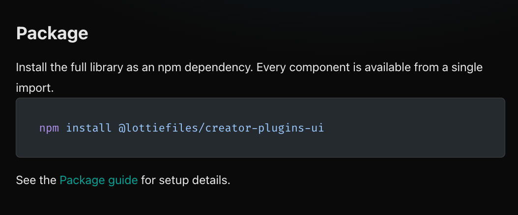
From the UI Library installation section, copy the npm installation command.
Run it inside your plugin project from Terminal.
This installs:
```
@lottiefiles/creator-plugins-ui
```
* * *
## 12\. Import the Creator Button
Back in `app.tsx`, import the `Button` component:
```tsx
import { Button } from "@lottiefiles/creator-plugins-ui";
```
You also need to import the library’s styles:
```tsx
import "@lottiefiles/creator-plugins-ui/styles.css";
```
Your imports now include:
```tsx
import { Button } from "@lottiefiles/creator-plugins-ui";
import "@lottiefiles/creator-plugins-ui/styles.css";
```
* * *
## 13\. Replace the HTML Button
Change:
```tsx
```
to:
```tsx
```
Notice the uppercase `Button`.
This now comes from the Creator Plugins UI library rather than the browser’s default HTML elements.
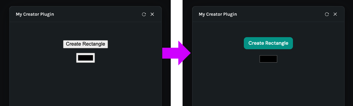
Once you save the project and return to Creator, the button should immediately adopt the styling provided by the UI library.
* * *
# Example `app.tsx`
After these changes, your UI code will look approximately like this:
```tsx
import { Button } from "@lottiefiles/creator-plugins-ui";
import "@lottiefiles/creator-plugins-ui/styles.css";
export const App = () => {
const createRectangle = () => {
parent.postMessage(
{
pluginMessage: {
type: "create-rectangle",
},
},
"*",
);
};
const changeColor = (
event: React.ChangeEvent
) => {
const hexToRgb = (hex: string) => ({
r: parseInt(hex.slice(1, 3), 16),
g: parseInt(hex.slice(3, 5), 16),
b: parseInt(hex.slice(5, 7), 16),
});
parent.postMessage(
{
pluginMessage: {
type: "change-color",
color: hexToRgb(event.currentTarget.value),
},
},
"*",
);
};
return (
);
};
```
* * *
# Example `plugin.ts`
The corresponding plugin logic will contain both message handlers:
```tsx
creator.ui.show();
creator.ui.onMessage((msg: any) => {
if (msg.type === "create-rectangle") {
const scene = creator.activeScene;
const x = scene.size.width / 2;
const y = scene.size.height / 2;
const layer = scene.createShapeLayer({
position: {
x,
y,
},
});
layer.createRectangle();
layer.createFill({
type: "SOLID",
color: {
r: 255,
g: 0,
b: 0,
},
});
layer.position.addKeyframes([
{
frame: 0,
value: {
x,
y,
},
},
{
frame: 100,
value: {
x: x + 120,
y,
},
},
]);
}
if (msg.type === "change-color") {
const node = creator.selection.nodes[0];
const fill = node.fills[0];
fill.color.staticValue = msg.color;
}
});
```
* * *
# How the Two-Way Interaction Works
Our plugin now has two different interaction patterns.
### Creating content
```
Plugin UI
↓
"create-rectangle"
↓
plugin.ts
↓
Creator API
↓
New rectangle
```
### Modifying content
```
Selected Creator object
↑
Fill
↑
plugin.ts receives "change-color"
↑
Plugin color picker
```
Together, these demonstrate one of the most important concepts in Creator plugin development:
```
Plugin UI
↕
Plugin Logic
↕
Creator Scene
```
* * *
# What We Built
In this tutorial, we extended our plugin so it can:
- Display a native color picker
- Read the selected hex color
- Convert hex into RGB
- Send the RGB color through `postMessage`
- Access the currently selected Creator node
- Access that node’s first fill
- Modify its fill color
- Stack and center plugin controls
- Add spacing to the interface
- Install the Creator Plugins UI library
- Replace a native HTML button with the Creator `Button` component
* * *
# What’s Next?
We now understand the basic mechanics of developing Creator plugins manually.
So far, we’ve learned how to:
```
Create UI
↓
Send Messages
↓
Read Creator Data
↓
Modify Creator Objects
↓
Create Animation
```
In the next part of the series, we’ll take a different approach.
Instead of writing all of the plugin code ourselves, we’ll look at how to develop a Creator plugin using a **coding agent** and the Creator plugin development skills.
---
## Related Articles
- [How to Create Animations with AI Using Lottie Creator WebMCP](/blog/working-with-lottie-animations/how-to-create-animations-with-ai-using-lottie-creator-webmcp)
- [How to Build Your First Lottie Creator Plugin: Create and Animate a Rectangle](/blog/working-with-lottie-animations/how-to-build-lottie-creator-plugin-create-and-animate-a-rectangle)
- [How to Develop and Publish a Plugin for Lottie Creator](/blog/working-with-lottie-animations/how-to-develop-and-publish-a-plugin-for-lottie-creator)
- [How to Publish a Lottie Creator Plugin to Extensions](/blog/working-with-lottie-animations/how-to-publish-a-lottie-creator-plugin-to-extensions)