LottieFiles

Motion design is a broad discipline spanning from film titles, brand animation, motion graphics and product UI. This page focuses on using functional motion in product designs.


The human visual system evolved to detect movement before color or shape, making a well-timed transition one of the fastest ways to guide attention, explain a change and reduce cognitive load. Below we break down the science, timing specs, accessibility rules and the format that makes it practical across platforms.

<350ms

<350ms

<350ms

<350ms

Motion captures attention before conscious thought

200–400ms

200–400ms

200–400ms

200–400ms

The window where motion feels intentional and not slow

Faster element recognition in expressive motion-rich UIs

90–97%

90–97%

90–97%

90–97%

Smaller files

with Lottie vs GIF

Why does the brain notice motion before color or shape?

Why does the brain notice motion before color or shape?

Motion processing is biology, not preference. Humans evolved to detect movement before everything else, a reflex that predates conscious though. That changes how you think about every transition, loader and micro-interaction in your product.

Motion processing is biology, not preference. Humans evolved to detect movement before everything else, a reflex that predates conscious though. That changes how you think about every transition, loader and micro-interaction in your product.

<350ms

<350ms

<350ms

Motion precedes conscious awareness in various contexts

Motion precedes conscious awareness in various contexts

Neural processing of motion begins at 50ms. Conscious awareness follows at 350ms. In that window, attention is already decided.

Yu et al. (2019). Neuroscience 415, 230–240.

79%

79%

79%

Static interfaces lose users to change blindness

Static interfaces lose users to change blindness

A visual change without motion marking the transition goes undetected, even an obvious one. On mobile, a screen flicker alone drops detection from 93% to 33%.

Davies, T. & Beeharee, A. (2012). CHI '12, 2155–2164.

Motion-rich interfaces drive faster comprehension

Motion-rich interfaces drive faster comprehension

Across 46 studies and 18,000+ participants, users identified key UI elements up to 4× faster in expressive interfaces. The effect held across all age groups.

Google Design Team. (2025). Material 3 Expressive

200–400ms is not a guideline, it’s a biological specification

200–400ms is not a guideline, it’s a biological specification

200–400ms is not a guideline, it’s a biological specification

Three independent fields landed on the same number without coordinating. Neuroscience identified 200–350ms as the brain's conscious awareness onset. The Doherty Threshold put the interaction limit at 400ms to keep users' attention and increase productivity. Google Material Design encoded the same window in its motion system.


The window has edges. Below 200ms, motion hasn't reached conscious registration. Above 600ms, continuity breaks.

So, how does timing change the way motion feels?
Same distance. Same easing. Different duration. Tap to see how timing changes the feel of motion.

Use case
Use case
Window
Window
Why
Why

Toggle / tap / button

Toggle / tap / button

50–150ms

50–150ms

Reflexive

Reflexive

Dropdown / error

Dropdown / error

200–400ms

200–400ms

Responsive

Responsive

Modal / expand / slide

Modal / expand / slide

300–500ms

300–500ms

Spatial

Spatial

Navigation / page change

Navigation / page change

500-799ms

500-799ms

Transitional

Transitional

Success / onboarding / hero

Success / onboarding / hero

700 - 1,200ms

700 - 1,200ms

Expressive

Expressive

So, how does timing change the way motion feels? Same distance. Same easing. Different duration. Tap to see how timing changes the feel of motion.

So, how does timing change the way motion feels? Same distance. Same easing. Different duration. Tap to see how timing changes the feel of motion.

Loading animation…

150ms

400ms

500ms

800ms

1200ms

What does motion actually do in an interface?

What does motion actually do in an interface?

It works at three levels at once. The same animation that captures attention also reduces cognitive load and creates a memory. These are not separate effects, they are one mechanism with three outcomes.

It works at three levels at once. The same animation that captures attention also reduces cognitive load and creates a memory. These are not separate effects, they are one mechanism with three outcomes.

Perception

Perception

Motion tells the brain where to look and what just changed. Animated transitions reduce spatial reconstruction errors, users understand system state without consciously tracking it. The interface explains itself.

Perceived performance

Perceived performance

Animation offloads cognition to the perceptual system. Skeleton screens don't make things faster, they make waiting feel productive. Users consistently rate animated systems as faster even when completion time is identical.

Memory

Memory

Micro interactions create emotional peaks. Task, completion, confirmation, progress, celebration, these moments are encoded more durably in memory than neutral interactions.

What great motion actually looks like

What great motion actually looks like

What great motion actually looks like

The products that win won't have the best algorithms.

They'll have the best feel.

The products that win won't have the best algorithms.

They'll have the best feel.

Interactive animations

Interactive animations

Real-time UI

Real-time UI

Interactive blogs

Interactive blogs

Success state

Success state

Delightful digital experience

Delightful digital experience

Product walkthrough

Product walkthrough

Does motion hurt
accessibility, or help it?

Does motion hurt
accessibility, or help it?

Does motion hurt
accessibility, or help it?

Done carelessly it can harm. Done well it helps everyone. Poorly designed motion triggers dizziness, nausea, and disorientation — and affects a meaningful portion of users on every platform. This is why accessibility guidelines like WCAG exist.


The constraints built to protect sensitive users often produce better motion for everyone. Purposeful intent and appropriate timing aren't accommodations. They're what well-designed motion looks like in the first place.

Motion needs a purpose

Motion needs a purpose

Every animation should communicate state, confirm action, or guide attention. "Looks cool" is not a sufficient reason.

Auto-playing motion needs a way out

Auto-playing motion needs a way out

WCAG SC 2.2.2 requires animation running longer than 5 seconds to be pausable. 'prefers-reduced-motion' should be respected automatically.

Flashing content has a hard limit

Flashing content has a hard limit

WCAG SC 2.3.1 prohibits content that flashes more than 3 times per second. A threshold set to prevent seizures, not just discomfort.

Reduced motion ≠ no motion

Reduced motion ≠ no motion

Fade and opacity transitions preserve meaning without triggering vestibular responses. Design for reduced-motion from the start.

When is motion the

wrong choice?

When is motion the

wrong choice?

When is motion the wrong choice?

Motion is a tool, not a default. There are interfaces where the most useful animation is none at all. If any of these describe your screen add motion sparingly or skip it.

Motion is a tool, not a default. There are interfaces where the most useful animation is none at all. If any of these describe your screen add motion sparingly or skip it.

Dense, scan-heavy data views

Dense, scan-heavy data views

Dashboards, tables, and trading or analytics screens are read fast. Transitions that redraw rows or charts add latency and pull the eye away from the number the user came for.

High-frequency actions

High-frequency actions

A 300ms animation feels great once. On an action a power user triggers 100 times a day it becomes 30 seconds of waiting. Make high-frequency actions instant.

Motion with no job to do

Motion with no job to do

If an animation does not communicate state, confirm an action, or guide attention, it is decoration. Decorative motion adds cognitive load and file weight without earning either.

Reduced-motion and low-end devices

Reduced-motion and low-end devices

For users who set prefers-reduced-motion, full motion can cause real discomfort, so honor the setting. On low-powered devices a janky 12fps transition reads as broken and is worse than a clean cut.

If your animation does not do a job, the most honest design decision is to delete it. We would rather you ship less motion than ship motion that costs your users time.

What is the best format for shipping motion?

What is the best format for shipping motion?

Most teams end up choosing between GIFs that bloat load times, CSS animations that don’t cross platforms, or video files that need codec management. Lottie was built to solve all three: a vector-based, JSON animation format that renders natively across your product.

Most teams end up choosing between GIFs that bloat load times, CSS animations that don’t cross platforms, or video files that need codec management. Lottie was built to solve all three: a vector-based, JSON animation format that renders natively across your product.

The old way

The old way

GIF, video and CSS animation

GIF, video and CSS animation

GIFs are often 2MB+ with no transparency, interactivity or theming

CSS animations stay on the web and don’t translate to iOS or Android

Video adds codec choices, autoplay restrictions and bandwidth costs

Different platforms require different assets

Animation updates trigger rebuilds across platforms

Modern approach

Modern approach

Lottie JSON and dotLottie format

Lottie JSON and dotLottie format

Vector-based JSON that scales to any screen size without losing quality

Native rendering across Web, iOS, Android, React Native and Flutter

Proven to be 90–97% smaller than GIFs in production across millions of sessions

dotLottie supports multiple animations, state machines and interactive experiences in a single file

Officially assigned an IANA-registered media type

Over 280,000 companies ship Lottie animations today.

Over 280,000 companies ship Lottie animations today.

Over 280,000 companies ship Lottie animations today.

iOS

iOS

Android

Android

Vue

Vue

Web

Web

Flutter

Flutter

React

React

React Native

React Native

Angular

Angular

What happens when teams ship motion in production?

What happens when teams ship motion in production?

What happens when teams ship motion in production?

See how companies using Lottie-powered motion in their products improved key business and product metrics.

See how companies using Lottie-powered motion in their products improved key business and product metrics.

Make performance and creativity coexist

Switching to Lottie reduced animation file sizes by 80% without losing visual quality or creative range.

Business case:

A file that's 80% smaller means faster load times on high-traffic pages without stripping out what makes the design work.

Engagement

Engagement

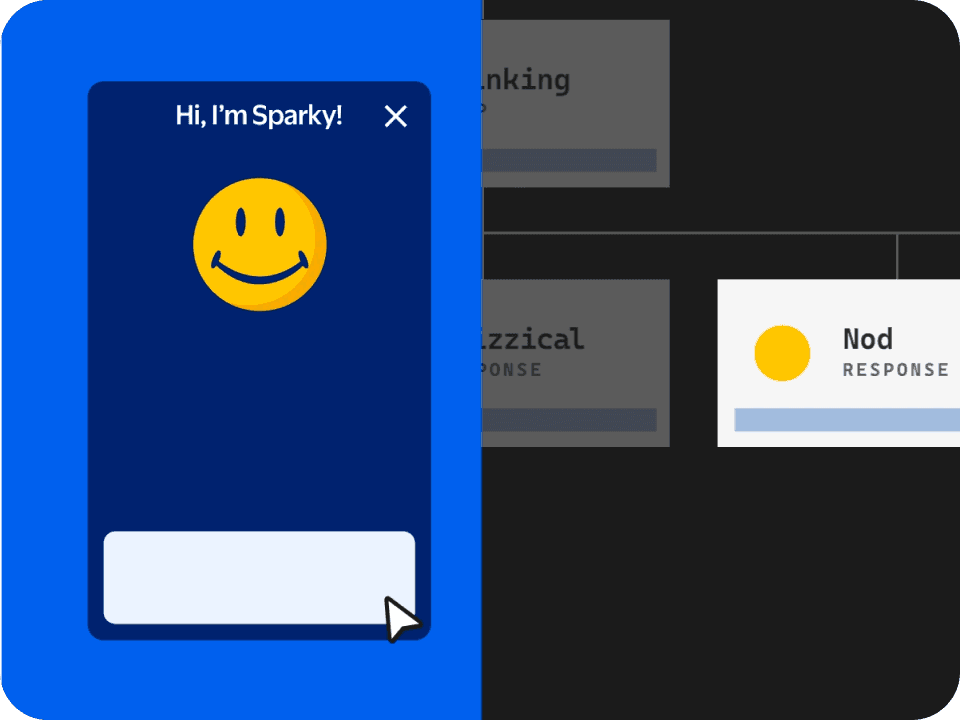
Build characters that scale without limits

Sparky runs on 60+ Lottie animations, each just 20–30KB, 10% the size of a GIF.

Business case:

Expressive character animation at enterprise scale needs to be lightweight enough to perform across millions of devices.

Brand Experience

Brand Experience

Turn attention into

measurable action

ET Money's home-screen CTR climbed from 2-3% to 8-9% (peaking at 11%), while production time fell 40%.

Business case:

Motion that drives action needs to ship fast and iterate faster. The workflow shouldn't slow down what the product is proving.

Conversion

Conversion

Keep motion light enough for app scale

Switching to dotLottie cut Gojek's animation file size by up to 89.35% versus JSON and improved memory stability by 99.6%.

Business case:

A file that's 89% smaller isn't just an engineering win. It's motion that actually survives production at scale.

Performance

Performance

Turn storytelling into an experience

Lottie-powered animations drove 2.5 minutes average time on site across 30,000 unique visitors.

Business case:

Motion that guides readers through a narrative keeps them engaged longer, without slowing the page down.

Storytelling

Storytelling

Make motion reusable across product and brand

Wise built one lightweight, translatable animation system spanning product and marketing, using dotLottie and After Effects templates.

Business case:

Motion that spans product and marketing needs one source of truth. The workflow should make reuse easier than rebuilding from scratch.

Brand system

Brand system

Everything you need to create, ship and manage motion in one place

Everything you need to create, ship and manage motion in one place

Everything you need to create, ship and manage motion in one place

Lottie is the format. LottieFiles is the platform that connects the people who create motion to the products that ship it. From first keyframe to production deployment.

Lottie is the format. LottieFiles is the platform that connects the people who create motion to the products that ship it. From first keyframe to production deployment.

01 — Create

Design in the tools you already use

Design in the tools you already use

Animate on Lottie Creator, After Effects or using Figma. Your existing workflow, extended.

02 — Manage

One home for every approved animation

One home for every approved animation

Centralized workspaces with versioning, permissions and review. No asset in a Slack thread.

03 — Ship

One file across every runtime

One file across every runtime

Deliver consistent dotLottie to web, iOS, Android and more. Change once, update every surface automatically.

Lottie Creator

After Effects

Figma

Workspace

dotLottie Runtime

Lottie Creator

Designed to create ultra-lightweight, highly customizable and interactive animations for web, apps and social. Superpowered with AI-based Motion Copilot.

AI keyframes

Themes & tokens

State machines

Interactivity

Lottie Creator

After Effects

Figma

Workspace

dotLottie Runtime

Lottie Creator

Designed to create ultra-lightweight, highly customizable and interactive animations for web, apps and social. Superpowered with AI-based Motion Copilot.

AI keyframes

Themes & tokens

State machines

Interactivity

Frequently asked questions

Frequently asked questions

What is motion design?

Motion design is a broad discipline: the craft of designing movement and animation to communicate an idea. It spans film and TV titles, brand and marketing animation, motion graphics, and the motion built into digital products. This page focuses on the last of those, motion design in products, where animation is functional: it guides attention, shows what changed, and confirms a user's actions in real time.

What is the difference between motion design and motion graphics?

In practice the terms overlap, and many people use them interchangeably. The useful distinction is by purpose rather than label. Motion graphics are linear animations made to be watched, such as explainer videos, title sequences, and social ads. Product or UI motion is interactive: it reacts to user input, communicates system state, and lives inside the software. Both sit under the wider umbrella of motion design. One is made to be viewed, the other to be used.

How long should a UI animation be?

Most UI animations should live between 200–400ms. Below that it's too fast to register. Above that it starts to feel like lag. But it depends on what you're animating.

Micro-interactions lit buttons sit at 100–200ms, fast enough to feel instant without becoming subliminal. State changes and transitions belong in the 200–400ms window where Dehaene's conscious awareness research, the Doherty Threshold and Google Material Design all converge. Full screen transitions tends to need more room at 300–500ms and loading states run longest at 400–600ms, long enough to feel like progress without fracturing flow.

Research also confirms the hard edges. Below 50ms motion is subcortical and registers as threat not feedback. Above 600ms flow breaks and users are waiting for the product rather than moving with it.

Does motion design hurt accessibility?

Poorly designed motion triggers dizziness, nausea and disorientation, which is why WCAG dedicates three separate criteria to motion alone. The fix isn't removing animation. It's giving it purpose, keeping timing in the 200–400ms window, making long-running motion pausable and respecting 'prefers-reduced-motion'. Reduced motion is not no motion. Fades and opacity changes preserve meaning without triggering harm.

Why does motion matter in product UX?

Because the brain is built for it. The visual system detects movement before color or shape, so motion is the most reliable way to direct attention, explain what changed, and make an interaction memorable. In production, teams have tied well-designed motion to higher conversion, clearer guidance, and stronger engagement.

When should you use motion in a product?

When it does a job. Use motion to guide attention to the next action, show what changed between two states, confirm that something worked or make a wait feel shorter. The strongest moments are onboarding, state transitions, loading, success and error feedback and key reward moments. Skip it on dense data views and actions people repeat many times a session, where it adds friction rather than clarity.

Does motion design improve conversion?

It can. Motion that points attention at the right action at the right moment has driven measurable lifts. ET Money lifted home-screen click-through from 2–3% to 11% and OK Cashbak grew daily visits by 62% after adding character animation.

Motion is not a guaranteed lift on its own. It works by making the right next step clearer and the experience more memorable.