


As website design advances, it becomes increasingly difficult for the older generation to keep up. With tasks such as paying bills, staying in touch with family, and ordering grocery deliveries all being managed digitally nowadays, those who are not confident using electronic devices are facing more and more barriers.
A significant 88% of people aged 75 and over browse the internet at least once a month, yet many do not have the skills required to carry out basic tasks independently. Around 24% are unable to turn on the device and enter login information, 32% cannot find various applications, and 27% struggle to adjust the settings to meet their needs.
In this article, we explain why web design needs differ for senior audiences. We will then discuss 6 of the biggest design considerations you should keep in mind when creating your website, providing some examples of well-known businesses that have successfully catered to older users.
Why Usability Needs Differ for Older Audiences
Although a large proportion of the older generation have spent their lives avoiding modern technology and failing to keep up with advancements, it is becoming increasingly difficult to do so.
Websites that are primarily targeting a more senior audience need to be aware that many of their users are not typically confident online. This can be due to a range of factors that impact how their usability needs differ from those of younger generations.
- Less motor control
As we age, precise movements become more challenging and everyday tasks can become more difficult due to decreased motor control. Changes to the brain and muscle strength mean that gestures that were once second nature become more complex. This impacts website usage since actions like tapping small buttons and pinching to zoom may be difficult. - Language style
Today, the online world is filled with modern phrases and acronyms that may be unfamiliar to the older generation. Many older audiences still use more traditional language that is straightforward yet formal. If they are faced with complex technical jargon and modern slang, then they may struggle to understand. - Reduced vision
Sight problems are common with age, meaning seniors are not always as able to browse websites in the same way as younger people. Certain colour combinations, fonts, and interfaces can be difficult for those with reduced vision, making it challenging for them to navigate a website. - Technology knowledge
The older generation did not grow up around modern technology, so learning to use it later in life can bring added challenges. This knowledge gap can make it problematic when browsing the internet and performing essential tasks. This gap continues to widen as website design principles advance and interfaces become more technical.
Understanding Tech Habits Among Senior Users
Using modern technology does not come naturally for many of the older generation. Having spent most of their lives free of the digitalisation that has transformed the modern landscape, seniors are having to learn new skills in later life in order to carry out essential tasks.
There is a lot of fear and uncertainty among the older generation when it comes to using technology. Since it is so unfamiliar, the perception of complexity can make them hesitant to adapt. This has created a big divide between generations, but as businesses move from traditional paper-based processes to digital equivalents, the elderly are having to find their way.
More older people than ever before have had to use new technologies in order to stay in touch with their loved ones. Whether this consists of using Zoom to video call long-distance friends, WhatsApp to message family members, or Facebook to see what people are up to, getting used to new platforms is bound to require a transition period before it becomes comfortable.
The devices used by seniors also need to be taken into consideration since they differ from devices used by younger generations. Tablets are much more desirable among older people due to the increased screen size – especially useful for those who struggle with motor control. Being used by 49% of those over 65 in the UK, tablets create a more accessible way for the older generation to use modern technology.
Although there are still a high number of barriers when it comes to technology being accepted and used by seniors, older people are slowly becoming aware of the associated benefits. Being able to contact loved ones and access key services from a handheld device means they are able to maintain independence and stay connected.
How Can Web Design Bridge the Gap Between Seniors and Technology?
Even though many seniors have begun using technology in their daily lives, there is still a long way to go. Businesses that cater to older users need to be aware of the struggles faced by their customers and create accessible websites that can be used by all.
Web design is crucial, often being the difference between an older user being able to find what they are looking for and an older user getting frustrated and confused. Designers have a responsibility to build up the confidence of their end users and provide an online platform that achieves the desired outcome for both the user and the business.
Even the smallest of details need to be considered when designing a website for senior users. Being aware of how the older generation uses technology and designing an interface that improves the UX for those who are not confident browsing the web will not only help them find what they are looking for, but can help generate long-term customer loyalty.
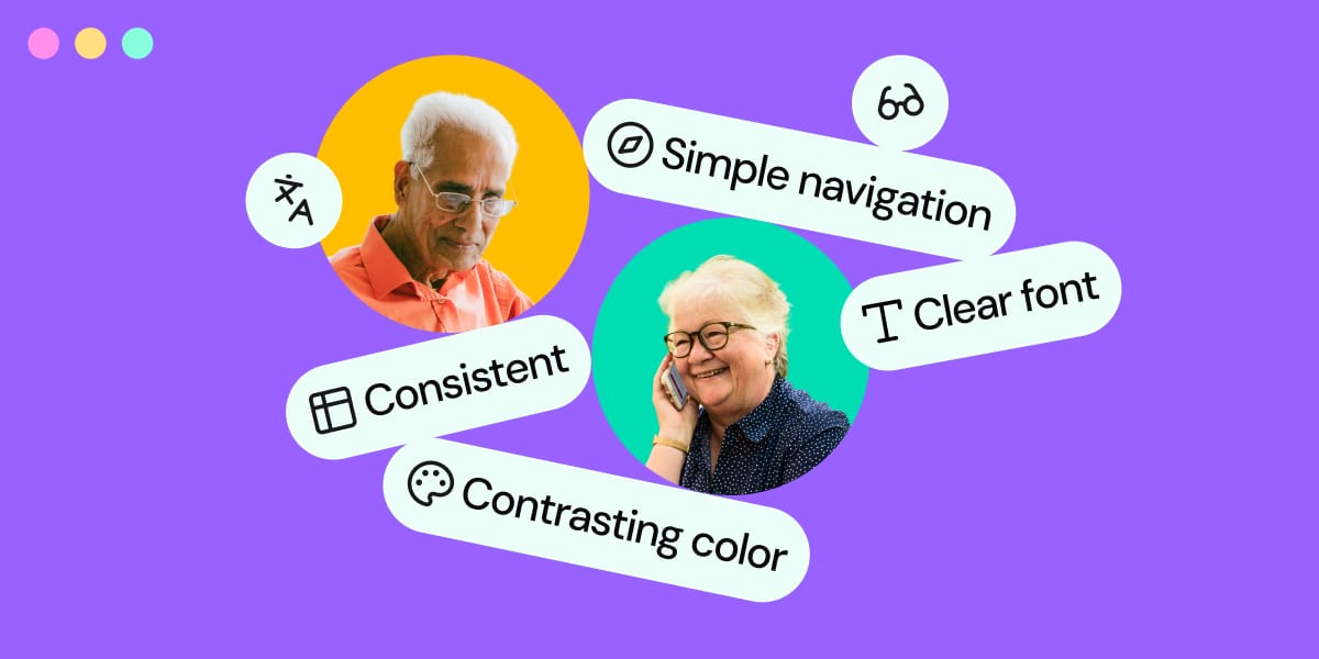
6 Web Design Considerations you Should be Aware Of
If your business caters to the older generation, this needs to be taken into consideration during the website design process. Although a sleek interface may look great and cater well to younger users, seniors are going to struggle to access the site.
Instead of creating an all-singing, all-dancing site that looks great to your eye, put yourself in the shoes of your typical customer and consider the usability aspects before it comes to aesthetics.
The following six design considerations need to be accounted for to ensure that your new site is fit for purpose and provides your users with an enjoyable browsing experience.
1. Simplify navigation
When a senior user arrives at your website, the layout should instantly guide them in the right direction. Having a clear navigation structure that includes well-labelled menus and buttons will create an obvious solution that supports users who lack technical confidence.
The website theme you opt for should be chosen in line with the needs of your target audience. Complex designs are going to be overwhelming, so instead, the structure of the theme should be simple and follow clear paths.
When a user arrives at the site, the navigation options should be immediately visible – any drop-down menus or hamburger menus can be easily overlooked. Icons and symbols are great space savers, but in this case, their purpose may not be clear and could leave your users unsure of how to leave the home page.
Similarly, if there are too many options on the navigation bar, it can become overwhelming for the user and leave them uncertain about how to navigate the website. Sticking with a small number of clear options in the navigation bar is the recommended approach when your audience is not confident online.
By creating different website pages to target users with different goals, the navigation is instantly simplified. Some key features that your users may be searching for include being able to make a purchase, being able to get in touch, or being able to find information regarding a question they have.
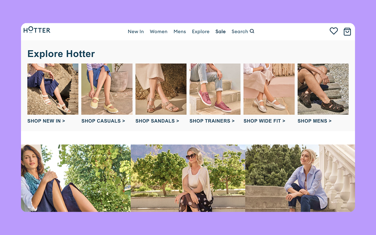
The image below is taken from the homepage of Hotter, a shoe brand targeting the older generation. The interface is simple and the navigation bar is easily recognisable. As well as having a clear navigation bar, popular categories are also accessible from the homepage, along with pictures to support the user when searching for the right product.
2. Choose contrasting colours
Older people are more susceptible to visual impairments and this needs to be taken into account when designing your website. Being able to read small text and see colours in the same way a younger person might is not guaranteed among seniors, so website designers need to plan accordingly.
If important text is placed on top of a busy image or uses a bright font colour on an already coloured background, it can make it difficult to read. When it comes to key messaging, it is best to play it safe and avoid fonts in colours such as blue, green, yellow, and purple, as these are the colours most commonly confused among people with colour blindness.
There should be a high contrast between the text and the background to ensure readability. Any writing should be kept against a plain background that differs strongly in colour from the font. Typically, this would include using dark text on a light background, or vice versa.
This also applies to CTA buttons. Many designers opt to use bold colours on their buttons to catch the attention of the user and encourage them to take action, but this can hinder accessibility for those with visual impairments. The colour of the button should have enough contrast with the overlaying text, and if any click effects are chosen, this should also take the needs of the user into consideration.
As well as ensuring that text is easy to read, picking contrasting colours will prevent eye strain. If a user can comfortably read through the content and navigate the site, they are much more likely to stay on the page and engage with the content for longer.
3. Keep language simple
Content is a key part of any website and needs to be written in line with the tone of voice of the business. Achieving a consistent style of language that resonates with the target audience will help create a strong brand image that aligns with the needs of the users.
When designing a website for a senior audience, it is important to use language that is familiar to them. Stay clear of using complex industry jargon or acronyms as these can overcomplicate things and leave users more unsure than they were before landing on the site.
Instead, use plain English in short and simple sentences. By sticking to traditional language and writing in a way that is almost conversational, older users will have an easier time following the content.
If any complex language is necessary to explain a product or service, make sure to break it down for those who are unfamiliar with the terms. By creating content that is easy to digest, the user is more likely to trust the product or service on offer and will understand the benefits that they can bring.
To avoid overwhelming users with a content-heavy web page, the writer should ensure the text is broken down into manageable chunks. Using short sections of text alongside clear headings and relevant imagery will make the page scannable. Bullet points are also an effective way to break up paragraphs and help the reader digest the information.
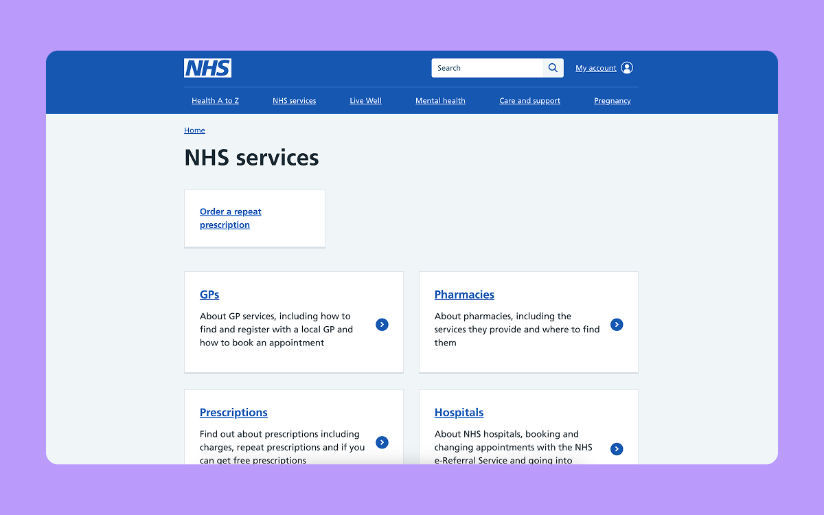
The example below shows a snippet from the NHS website. Since their service caters to a wide demographic and needs to be accessible to the older generation, it needs to be inclusive. They have kept the text to a minimum and ensured that navigation options are clear. You can also see that they have used common questions to inform their copy and aid navigation, i.e., “how to find and register with a local GP and how to book an appointment”.
4. Create a consistent page format
When figuring out how to use an online service, seniors can benefit greatly from recognisable patterns. Predictability will help them gain confidence online and be able to navigate through your site with ease.
Key elements of your website, such as the navigation bar, contact information, and search bar, should be kept in the same position across every page. This will help older users get to grips with the interface and ensure they have continuous access to the most essential features.
The aesthetics of your web design should also remain consistent, sticking with the same fonts, colour schemes, and modules across all pages so it doesn’t cause confusion if things change. Although this may seem like a good web design practice in general, there is a greater need to create a repetitive page format when catering to the older generation.
By keeping your website simple and avoiding fancy features, your target audience is more likely to get used to using your site and being able to find what they need. When it comes to web design for the older generation, consistency really is key.
5. Use clear fonts
Typography is a crucial part of website accessibility – if the text is not clear to read, the whole website becomes unusable. For older users with visual impairments, this is especially important as any decorative fonts or small text can be virtually unreadable.
As a web designer targeting seniors, your website should stick with clear, sans-serif fonts. Some of the most famous fonts, such as Arial, Helvetica, and Open Sans, are popular because of how easy they are to read. They have been created to be easily scannable and maximise readability at all sizes.
When it comes to picking font sizes, practicality is just as important and the needs of older users must be considered. The default text size should be large enough to scan comfortably, sticking with the recommended 16px at minimum for body content.
Line spacing is also important, ensuring the chosen font has enough spacing to avoid it feeling crammed together. Typically, the rule of thumb is to include 130-150% spacing – improving readability so readers can comfortably skim through the content without straining their eyes. If a font is more decorative or bold, the spacing will need to be increased.
When testing your website from a font point of view, consider the screen size of different devices. If a senior user is accessing a site on a mobile or tablet, complex fonts may make it even more challenging for them to navigate.
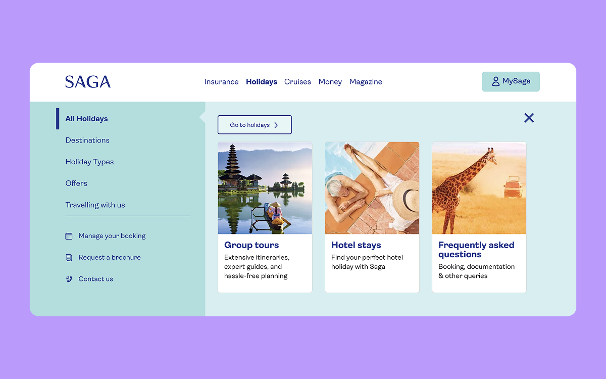
The image below shows the website of Saga, a brand that offers insurance and holiday packages for the older generation. They have kept the text to a minimum to avoid overfilling the page and use a simple font that is easy to read. To draw attention to the key pieces of information based on the webpage a user is on, they make the font bold – avoiding animations or colour changes.
Design for assistive technologies
Around 20% of the population needs assistive technology, so if your website is not designed accordingly, it becomes inaccessible to many.
For your website users who use assistive technologies, such as screen readers, magnifiers, or speech recognition software, your site should be compatible. This will ensure that the content can be accurately interpreted by the devices, providing the user with the necessary information even if they can’t see it.
By failing to adapt your website to be compatible with assistive technologies, you are making it inaccessible to a large proportion of users, especially when targeting an older audience. Creating an inclusive digital environment will provide your users with the confidence to browse independently.
Making sure your website is compatible with assistive technologies means you need to consider features such as adding descriptive image alt text, having a coherent website structure, and ensuring any forms are clearly labelled. If technology is able to interpret the contents of a web page accurately, it means users of all abilities are more likely to be able to navigate efficiently.
To test whether or not your website is compatible with assistive technologies, WAVE is a tool that can identify any issues and provide an accessibility score. It will generate a report that analyses the content and produces suggestions that can be implemented to enhance accessibility.
6. Undergoing User Testing with Seniors
Once your website has been created, carrying out a testing session with older users will offer invaluable insight.
Since seniors use technology in a very different way from the younger generation, witnessing them use your website firsthand will quickly identify any areas for improvement. Being able to watch them navigate the site and follow their click patterns will allow you to note down any areas of confusion which you can address.
A good tactic is to find testers who fit the demographic of your target audience. Provide them with a range of simple tasks that a regular website user may wish to carry out – some good examples include filling out a form, going through the checkout process, or using the search function.
By working alongside older users to finetune the design, the website will be better catered to the target audience. Undergoing this testing process is an important part of the web design process, finding ways to optimise the site and improve the UX design.
The Future of Senior-Friendly Web Design
As web design trends continue to evolve at a rapid speed, the abilities of seniors trying to navigate the web lessen.
Although interactive features, sleek navigation menus, and embedded multimedia are popular web design choices for many and offer value to a younger audience, they can have the opposite effect for those who are not familiar with the online world.
Being able to recognise that not everyone is comfortable with the digital age and accommodating senior users will help create an online space that they can navigate with ease. By removing some of the barriers that are preventing the older generation from being comfortable with technology use, they are able to build up their confidence and maintain a sense of independence.
Designing a website that welcomes older users with simplified navigation options, easily readable text, and compatibility with assistive technologies means seniors are able to browse at their own leisure and utilise your business's offerings.
If your business primarily targets an older audience, this should be clearly reflected in your website. As well as making the browsing experience easier for your users, this is bound to benefit your business since customers will be able to find what they need and will be more likely to convert.


