This article builds on the previous introduction to using Lottie animations in React so that you can control your Lottie. The last article took us as far as implementing a Lottie that would autoplay, and therefore didn't have any user controls. This article will guide you on how to add playback controls to your player.
User Controls
User controls provide user interface buttons to control playback of the Lottie. This article covers controlling your Lottie with buttons that:
- Stop
- Start
- Pause/Play
your animation.
React Development Environment
This walkthrough will use CodeSandbox as the online development environment so that anyone can follow along from any computer that runs a browser. This particular sandbox will render our App so that we can see the HTML output, i.e. our Lottie in action.
If you recall, from the first walkthrough, we tweaked our React App starter project to add a new folder to hold our Lottie JSON assets. We updated the dependencies to include react-lottie to enable playing Lottie in React. We edited the App.js file to import this dependency and our LottieFile's JSON. Finally, we edited the code to set up our page and call the animation.
Apply User Controls
Now you are ready to add user controls to your Lottie.
1. Add a stop and start button to control your Lottie
Currently, our Lottie is in autoplay mode using this code in App.js:
import React from "react";
import "./styles.css";
import Lottie from "react-lottie";
import animationData from "./lotties/kiss-of-the-heart";

export default class LottieControl extends React.Component {

  render() {
    const defaultOptions = {
      loop: true,
      autoplay: true,
      animationData: animationData,
      rendererSettings: {
        preserveAspectRatio: "xMidYMid slice"
      }
    };

    return <div>
      <Lottie options={defaultOptions}
              height={400}
              width={400}/>
    </div>
  }
}
1.1 Set up the initial state of the Lottie
By setting the class variable, we control the initial state of the Lottie and the buttons that we will add.
export default class LottieControl extends React.Component {

  // set initial state property
  state = {isStopped: false};
1.2 Setup the buttons
This means adding and referencing a button style and adding buttons that call onClick events to interact with the state property added above. Notice, we add isStopped to the Lottie component, which reads from the current state property (if you get stuck, see the full JS code).
1.2.1 First the button style
  render() {

    // add button style
    const buttonStyle = {
      display: "block",
      margin: "10px auto"
    };

   // ...

  }
1.2.2 Next, edit the Lottie component
(Notice that we open parenthesis here that will only be closed in the next section).
   // ...

    return (
      <div>

        {/* add Lottie component */}
        <Lottie
          options={defaultOptions}
          height={400}
          width={400}
          isStopped={this.state.isStopped}
        />
1.2.3 Finally, add the buttons
        {/* add stop button */}
        <button
          style={buttonStyle}
          onClick={() => this.setState({ isStopped: true })}
        >
          stop
        </button>

        {/* add start button */}
        <button
          style={buttonStyle}
          onClick={() => this.setState({ isStopped: false })}
        >
          start
        </button>

      </div>
    );
  }
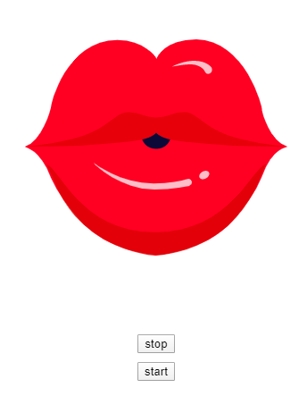
Now the user has the ability to stop and start the Lottie animation.
2. Add a Pause Button to Control Your Lottie
Our starting point for this section is the Lottie with stop/start button.
2.1 Repeat step 1.1 to set up the initial state of the Lottie and the button
This time, however, we set the isPaused property:
// set initial state property
state = { isPaused: false };
2.2 Setup the button
We will retain the button style set up for the stop/start example (1.2.1). Then, use one button to call the onClick events that interact with the state property added in 2.1 above.
2.2.1 Edit the Lottie component
This time we apply isPaused to the Lottie component, which reads from the current state property.
  // ...

    return (
      <div>
        {/* add Lottie component */}
        <Lottie
          options={defaultOptions}
          height={400}
          width={400}
          isPaused={ this.state.isPaused }
        />
2.2.1 Edit buttons
We will have just one play/pause button applying the isPaused state.
        {/* add pause/play button */}

        <button
          style={buttonStyle}
          onClick={() => this.setState({ isPaused: !this.state.isPaused })}
        >
          pause/play
        </button>
      </div>
    );

  // ...
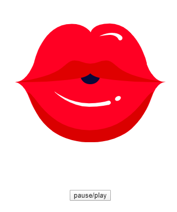
Now the user has the ability to pause and play the Lottie animation.
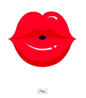
2.3 Improve the user experience
As a last touch, let's consider our user's experience and improve our pause/play button with dynamic naming.
2.3.1 This means adding another method:
  // add a method to determine the button label used
  buttonLabel() {
    if (this.state.isPaused === true) {
      return (<div>Play</div>);
    } else {
      return (<div>Pause</div>)
    }
  }
2.3.2 Edit the onClick event
Finally, change the onClick event to switch the isPaused state property. The method in 2.3.1.above is able to read the current state to determine the new label:
        {/* add play/pause button */}
        <button
          style={buttonStyle}
          onClick={() => this.setState({isPaused: !this.state.isPaused})}
        >
          {this.buttonLabel()}
        </button>
(If you get stuck, see the full JS code) below.
Now your user has a dynamically-labeled button to pause and play the Lottie animation.
You try it
If you are keen to incorporate animations smaller than an average PNG file into your React projects, then feel free to browse our animations, where you will find the best library of Lottie animations available for free.
Troubleshooting?
Full JS Code for Stop and Start Buttons
import React from "react";
import "./styles.css";
import Lottie from "react-lottie";
import animationData from "./lotties/kiss-of-the-heart";

export default class LottieControl extends React.Component {

  // set initial state property
  state = {isStopped: false};

  render() {

    // add button style
    const buttonStyle = {
      display: "block",
      margin: "10px auto"
    };

    const defaultOptions = {
      loop: true,
      autoplay: false,
      animationData: animationData,
      rendererSettings: {
        preserveAspectRatio: "xMidYMid slice"
      }
    };

    return (
      <div>

        {/* add Lottie component */}
        <Lottie
          options={defaultOptions}
          height={400}
          width={400}
          isStopped={this.state.isStopped}
        />

        {/* add stop button */}
        <button
          style={buttonStyle}
          onClick={() => this.setState({isStopped: true})}
        >
          stop
        </button>

        {/* add start button */}
        <button
          style={buttonStyle}
          onClick={() => this.setState({isStopped: false})}
        >
          start
        </button>

      </div>
    );
  }
}
Full JS code for Pause Button
import React from "react";
import "./styles.css";
import Lottie from "react-lottie";
import animationData from "./lotties/kiss-of-the-heart";

export default class LottieControl extends React.Component {

// set initial state property

  state = {isPaused: true};

// add a method to determine the button label used

  buttonLabel() {
    if (this.state.isPaused === true) {
      return (<div>Play</div>);
    } else {
      return (<div>Pause</div>)
    }
  }

  render() {

// add button style
    const buttonStyle = {
      display: "block",
      margin: "10px auto"
    };

// add default lottie options
    const defaultOptions = {
      loop: true,
      autoplay: false,
      animationData: animationData,
      rendererSettings: {
        preserveAspectRatio: "xMidYMid slice"
      }
    };

    return (
      <div>

{/* add Lottie component */}
        <Lottie
          options={defaultOptions}
          height={400}
          width={400}
          isPaused={this.state.isPaused}

        />

{/* add dynamic button */}
        <button
          style={buttonStyle}
          onClick={() => this.setState({isPaused: !this.state.isPaused})}
        >
          {this.buttonLabel()}
        </button>

      </div>
    );
  }
}