Examples of UI/UX Animation in Website Design


When it comes to websites or apps, motion design is an extremely helpful asset to have for user experience (UX) as it can build better connections, as well as make the entire experience a more user-friendly one.
While animation for websites are also used for aesthetics, there is a science behind why it works - our peripheral vision is sensitive to motion, making us more receptive and distracted by movement in general. Therefore, motion design in UI/UX is a powerful tool when it comes to website design as it has the power to attract user attention.
What is UI/UX animation in web design?
Previously, motion on websites were more for aesthetic purposes. For example, a featured animated image to attract attention, or an animation of the brand's mascot that can serve goals such as brand awareness.
However, with the science behind how we react to motion, websites have become more advanced with user interface (UI) and UX animation. Now we have animations that serve a larger purpose to engage and provide a response to the user - these can be loading and progress animations, navigation, and micro interactions. Additionally, UI/UX animation offers a more natural experience for users when interacting with the website.
The importance of micro interactions for user interfaces
Motion design in UI/UX helps acknowledge and react to input provided from the user – this is known as micro interactions. Micro interactions can be initiated when you press a button, swipe something, click an element, or perform any other action that triggers a certain condition. For example, when you add an item to your cart on an e-commerce site, an empty cart icon might animate into a filled cart.
These micro interactions, which can be implemented using subtle animation on a website or app, guides the user while offering an engaging experience. It also reduces cognitive burden as using micro interactions offers user feedback easily (if done right).
Here are some real-life examples of motion design and micro interactions in brand websites.
Twitter rewards your ‘like’ with an animated heart

Have you ever noticed that whenever you ‘like’ a tweet on Twitter, the heart icon animates to a red colored one, followed by a little burst of confetti? This animation lets you know that you’ve successfully completed an action, as well as adds a small moment of delight to your social media experience. Fun fact: Twitter’s heart animated icon is powered by Lottie animations!
Apple adds motion to product features

Consumer electronic giant, Apple, has added a subtle, yet effective motion on their website where clickable and scrollable elements are enlarged slightly when you hover your mouse over it. This helps tell the user that these elements are not static, and it leads to another page or action.
Airbnb adds a subtle arrow on their listings

Airbnb promotes short-term homestay and experiences. To give their user a more interactive and easy browsing experience when choosing a place to stay, their listing includes motion to allow users to look through pictures of the location.
When you hover over a picture, an arrow pops up on the right side to indicate that you can scroll through the picture without having to click on the listing. This is useful as it avoids the user from going through each listing to view pictures.
ASOS showcase their inventory quantity with a loading bar
For e-commerce websites, showcasing your inventory helps users to understand your options. One way to showcase this is through a loading bar.

British online fashion and cosmetics retailer, ASOS, has done just that by including a bar below their listing pages with subtle UI animation. The bar fills up every time you click “LOAD MORE”, and shows how many more products you have left to browse.
Etsy uses motion when adding items to the basket
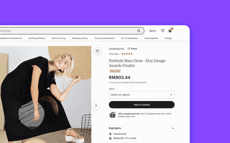
Etsy, a global online marketplace, applies plenty of subtle animation when it comes to adding items into a cart. First, when you click on “Add to basket” without indicating product details such as size, the bar turns red. When you finally add an item to your cart, a slider appears on the right-side of the screen to show that your item has successfully been added to the cart.
Adidas shakes their sizes up

Sporting goods brand, Adidas, uses animation on their individual product page. When you want to add a product to the bag but fail to indicate the product size, the size chart wobbles from left to right every time you click “ADD TO BAG”.
This is great as it reminds the user to select their size before adding to their bag. Doing this also indicates what the user needs to do before they can add an item into their cart.
Also, the five-star rating above the item name flashes to indicate that users can rate the sneakers!
Capturing user attention with aesthetically pleasing animation
As we touched upon briefly, our peripheral vision is what detects motion. Because of this, we are easily distracted by animation, regardless if it is meaningful or not.
Although micro interactions focus on actual user interaction for website functionality, adding animation to a website also creates moments of delight. We’re attracted to things that please us aesthetically, which is why adding elements beyond micro interactions could prove useful in keeping your users engaged on your website or app.
Here are examples of how you can use animation on your website to capture attention.
Nike and Levi’s adds a top bar with latest updates and promotions
We have an attention span shorter than a goldfish and it’s not even a joke. So, to capture a user’s attention takes more thought when building a website.
One way to draw attention and potentially increase conversions, is having a top bar with shoutouts about your latest promotions and product updates.

Using animation allows you to easily alternate between different promotions without having the user do anything. Athletic apparel company, Nike, does this with a simple top bar that slides left and right after a few seconds - just enough for us to read.

American clothing company, Levi’s, also has this at the very top of their website. The common theme for this UI animation is that both brands have kept it minimal in color with text that is short and sweet.
Netflix shows a preview of an actual product feature
For products or services, showing its features is important as this is what convinces people to endorse whatever it is you are selling.

Streaming giant, Netflix, does this by showcasing their download feature as animation on their homepage to support their statement that you can download and watch shows offline.
Apple and kiwi.com uses text animation
Text animation or motion is one of the easiest things to add in your website design. Although it might not have a practical purpose, it helps your branding and highlights your product.
Circling back to Apple’s website, they actually use Lottie animations for their text animations.

For example, the “mini” in their iPad mini uses motion design where the text is animated according to their popular screen gradient (you can check out the tutorial on how to do the exact animation here).
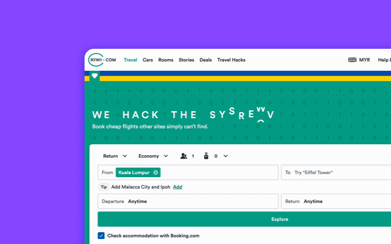
Kiwi.com, an online travel agency, also uses motion for their tagline. The text jumbles up from and changes from “WE HACK THE SYSTEM” to “YOU FLY FOR LESS”.
Mailchimp add animation to their 404 page
Many brands have switched out boring, static and dull 404 error pages for animated versions. 404 error pages have so much potential, especially with motion design - you can add in motion design to give it more interest, and pair it with a button that leads back to the homepages, or to other relevant links.

Mailchimp, a marketing automation and email marketing service, has done this with an adorable animation of a donkey with its head in the ground, and added a call-to-action to lead users back to the homepage. You can check out more examples of 404 animations here.
Microsoft uses transitions on their products

This tech giant is no stranger to UI animation. When you scroll through the Surface Laptop 5 overview landing page, the section titled “Complete your perfect setup with accessories” includes accessories that fade in to present themselves.
It’s certainly eye-catching, and to top it off, each of the accessories include an icon which you can click on and learn more about the product.
Quick facts and tips for adding UI/UX animation
As with all design concepts, there are the nitty and gritty details that make a world of a difference. This is no different for interface animation. In fact, these details are crucial to UI animation design for websites. So, here are some tips to takeaway:
- Keep it short: Something to keep in mind for micro interactions is that research has shown that a duration range between 200ms and 500ms is ideal when it comes to interface animations. For smaller animation elements, working between 200ms and 300ms is a good start. However, for larger animation elements, opting to work within the higher range of 400ms to 500ms is ideal.
- Don’t go crazy with animations: We know animations on websites are aesthetically pleasing and are able to capture the user's attention. But don’t overdo it as this can make it seem too busy and could cause your users to click out because there are too many distractions. So, make sure you define the goal of the webpage, and work from there by understanding how they complement the overall user interface.
- Remember other devices: When designing UI/UX animation for the website, always think about how it'll show on all devices such as mobile or tablets. For mobile design, it is suggested that animation should be kept at a duration between 200 and 300 ms, while tablets should be longer and in the higher range of 400ms to 450ms.
- Know the 12 principles of animation: This is based on two Disney animators and the laws of physics. Understanding these 12 animation principles could potentially help you decide what type of UI/UX animations to use and make a larger impact on your user. The principles include using animation that showcases anticipation, or adding more frames to an action sequence for more realism.
So, if you are currently working on a website design and are looking for animation assets, just browse through our free animation library. On top of that, LottieFiles also integrates with tons of design tools, like Figma and Adobe XD – you can also access Lottie animations within these tools. So, check these animations out today to get started!
You may also like
Animated Avatars with Lottie: Building Personalized, Interactive Personas
Lottie turns animated avatars into powerful UX building blocks.
Lottie Character Animation: Bring Your Brand Mascot to Life
Lottie’s unique qualities are ideal for personality-driven motion.
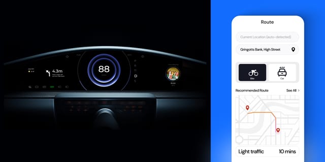
Lottie for Automotive Dashboards & Navigation UI
Here's how designers and brands are prototyping next-gen HMIs & navigation apps.

Struggling With Engagement? Here’s How UI Animation Can Fix It
Learn how motion guides users, adds feedback, and brings your site or app to life.